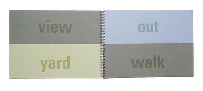
verbal framing


neighborhood, outlook, courtyard, outside, sundown, paintbrush, afternoon, nighttime, outdoor, viewpoint, openair, framework, stilllife, sketchbook, background, cobblestone , tree branch, sunset, landscape, clocktower, oaktree, brushstroke, gaslamp, sunlight, countryside, foothill
This elaboration on the previous framing project was completed for Krzysztof Lenk’s studio. Layering is successful when depth and dimension are added to the layers. The space of a book can be changed through the cutting away of pages. Viewers can then look at the book in space through the z axis, not just on the x and y dimensions of the pages. Just as buildings are viewed in section and not in plan, space in graphic design can be experienced through this z dimension. New word analogies are constructed through flipping the pages.
<< Home