Wednesday, November 30, 2005

verbal framing


neighborhood, outlook, courtyard, outside, sundown, paintbrush, afternoon, nighttime, outdoor, viewpoint, openair, framework, stilllife, sketchbook, background, cobblestone , tree branch, sunset, landscape, clocktower, oaktree, brushstroke, gaslamp, sunlight, countryside, foothill

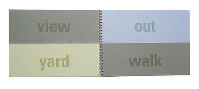
This elaboration on the previous framing project was completed for Krzysztof Lenk’s studio. Layering is successful when depth and dimension are added to the layers. The space of a book can be changed through the cutting away of pages. Viewers can then look at the book in space through the z axis, not just on the x and y dimensions of the pages. Just as buildings are viewed in section and not in plan, space in graphic design can be experienced through this z dimension. New word analogies are constructed through flipping the pages.

Sunday, November 20, 2005

on framing fragments 02


How do you selectively frame to play with spatial construction and deconstruction? The translation of a spatial journey into a two dimensional medium acts as a sequence of moments, simultaneously moving and stopped in time.

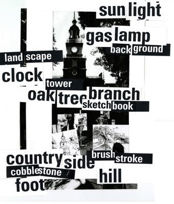
We were given a photograph and asked to respond to it in a 17x24 printed piece. Looking at the original image, I immediately became aware of the multiple canvases that were different interpretations of the clock tower in front of them. I noticed that every painter framed a fragment of the clock tower based on their own perception. As my response to the original image, I became interested in framing a fragment of the given photograph. The play of positive and negative, foreground, middle ground and background were simulated though layering fragmented words in a mock-up collage over the photocopied photograph. I kept making iterations of the original image and reinterpreting them. Almost in a cubist like fashion, I broke up words and the image background into the composition of the poster. The final printed piece evolved into three separate pieces, each one framing a given reality differently. Each framing resulted in a different perception of space.

Playing with two sizes of type and with positive and negative forms, the eye was tricked into reconfiguring the fragments in space. Normal perception was altered so that the foreground recedes to the background and the background jumps to the foreground. This spatial interplay on the two dimensional page created space and altered space. It utilized framing as a mechanism of creating boundaries for a given object or word. Type boxes on the page mimiced the vocabulary of the amateur painters stacked on the path in front of the clock tower. With the differentiation of words and hierarchies, the reader of the printed piece had a shifted reading of the flow of information. They could pick up fragmented thoughts according to how they perceived the structure.

Through scanning the three dimensional mock up, I focused on the fact that even the poster is an iteration or framing of reality. I highlighted the process of construction by playing with white or black frames, and by leaving a gap where the two scans were meant to be seamed together. Revealing these seams—these overlaps and juxtapositions—highlighted the hand of the interpreter. I stressed the fact that I constructed this interpretation of the original photograph, and that this was yet another iteration of the “real” clock tower. Frames within frames, layers upon layers, these were fragmented, simultaneous moments of the real experience. This honesty of interpretation and translation became an interesting, if obvious, way that form followed content and the project spoke about the construction of itself.

Tuesday, November 15, 2005

on framing fragments 01


Thursday, November 10, 2005

Learning from Las Vegas


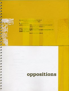
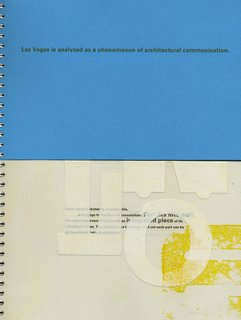
Learning from Las Vegas was a good case study to look at. The book developed for Anne West’s writing workshop dealt with the sign as a building, and how contemporary conception of space involves with signs, information and symbols rather than abstract form. Constructing an interactive book as a means of breaking up the space of the page, I created a book in a flipable form that allows endless variations and juxtapositions of pages and information.

It is really important to look at readings which are relevant to my topic but are also coming from a vocabulary of expression— architecture writing—that I am familiar with. I can reanalyze a lot better if I understand already the history, the background, the theory—all the things that make up the genre of writing. I can look at it with different eyes and see how it applies to my thesis topic. I think this has been a very a specific case study which allowed me to establish specific definitions to analyze oppositions of spaces and buildings.

I created a book in which the top and the bottom of the book can be turned at different speeds to create a vertical opposition of two bodies of content: modern architecture and vernacular architecture. Hammett was very intrigued by the reinterpretation of the text in the flipping book format. In this format, the flipping of the pages gives the reader variability and depth. Just as they perceive their surroundings in space, and can approach an isolated point from different sides, from the front or the back or either of the two sides, the flip book allows the reader to approach the book from different perspectives. The pages flip and have variability and depth. The depth and dimension is not frozen in space, but changeable depending on the user’s needs and interests. It is a flat page which has space in it.

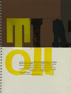
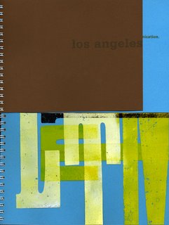
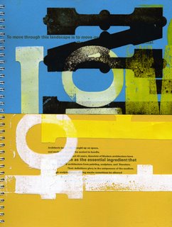
My book has a foreground, middle ground and background. It has depth not just in the variable page sizes, but in the pages that involve overlaps and juxtaposition of transparent letterforms. The juxtaposition of flatness and depth is a relevant topic of study for a book that deals with the content of a two dimensional sign taking the place of a three dimensional building.

The variable quadrants create a different sequence and different story depending on how the book is flipped. I liked the information from Learning from Las Vegas—but the complete quotes tend to get too overwhelming to juxtapose in the four quadrants. Maybe if I go in line by line, word by word, I can start making pairings between lines, and have a reason for juxtaposing the four quadrants together. Right now it is still paragraph by paragraph, the meaning is a bit more ambiguous when you start comparing paragraphs from top to bottom. What if it was a sentence, what if it was a word? That specificity would create a new unified whole from the fragments.

What am I going for when it comes to these fragments? Why would people want to reconstruct them? What do they want to get out of it? I like Hammett’s suggestion—the way I am fragmenting is more framing what I see rather than cutting apart for the sake of cutting apart. It involves the ideology that adding and subtracting allows the user to see something else on the page. The fragmentation has a construction aspect to it. I am trying it out with wax, dots, spray paint, letterpress and transparencies. All are 2D physical mediums but they allow people to have a new reading of the content with their interactivity and variability.

Monday, November 07, 2005

additive juxtaposition

The whole color, the tactile quality, makes the cyanotype a great medium, but a lot of what was lacking, was that I had paired snippets or broken fragments of my southwest trip with stanzas that were broken as well. A poem about palms—as much as liked the book about palm tress, and what palm trees mean—I think was too conceptually related to looking at the signs. I think if I had paired the signs—which are pretty abstract already even though they are specific signs—their context, how I broke the background up, how I reconfigured the page. I had broken up something I had seen, I had already framed it one way by taking the photograph, I was re framing it again by putting it on a piece paper that had changed it. It kept being framed and framed again.

I think a better juxtaposition—if it needed one, that’s debatable as like them as pictures as themselves—would have been to pick something specific. If I chose a passage about the language of signs as buildings, I could have picked something very specific, looking at a pertinent quote. Maybe, “What is the sign now?” could have been a topic to study.